Ink Before Hops: Six Phoenix Can Designs That Do Half the Pouring
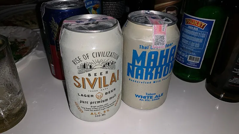
Photo: Chainwit., CC BY-SA 4.0, via Wikimedia Commons
In a taproom, the chalkboard does the selling. You read three lines, ask a question, take a taster, and decide. Buying a four-pack out of a cooler is a different transaction altogether. No bartender, no sample, no chance to change your mind — just a cold cylinder and whatever it has decided to tell you. In a city where a healthy share of local ale now leaves the building in a to-go bag, that makes the label the first pour, and the only sales pitch you get.
The Can Has Picked Up Extra Jobs
Once the compromise package, the can is now the default for limited releases, taproom to-go stacks, and the corner store shelf. In Phoenix it is also a sun shield. Aluminum shuts out the light that turns hops harsh and papery, which is why a can that rides around in a hot car for an hour is a safer bet than the same beer in glass. Designers know this, and they know the can will be read in bad light — a dim cooler, a glovebox, a patio at dusk. So the good ones design for the worst viewing conditions first and the Instagram second.
There is a practical hierarchy on any can. The name has to land from six feet away. The style has to land from two. The details — canned-on date, ABV, malt bill, who drew the thing — only matter once it is already in your hand, and those details are where the trust gets built or lost.
Six Cans That Reward a Second Look
Sunbake Ale, Nine Rails Brewing. A local muralist covered this one in a bleached-out skyline with a heat shimmer worked into the lettering, and the ink shifts color as the can chills. Gimmicky? Slightly. Effective? Completely. The design promises something bright, low in bitterness, and built for 105 degrees, and the beer behind it delivers exactly that. When art and liquid agree, you forgive the parlor trick.
Canal Water Wheat, Copper State Ferment Works. The label reproduces a 1910s map of the Arizona Canal, all hairline blue linework on an unfussy cream field. The illustration sells the heritage angle, but the tiny type on the side does the real work: it names the farm that grew the White Sonora wheat and the week it was milled. Soft, hazy wheat beer is what you expect, and the fine print earns the expectation.
Papago Porter, Saguaro & Sons. Matte finish, near-black can, and a single botanical line drawing of a creosote branch. Nothing else. It is the rare dark-beer label that resists the urge to shout about chocolate and roast and instead lets restraint do the talking. The beer is likewise restrained — more cocoa nib than dessert. Whether that is smart marketing or a missed opportunity depends on how much you like being told what to think.
Citrus Row Pale, Sixth Street Fermentory. Letterpress-style type, three flat colors, and a row of citrus wheels that could have come off a 1960s produce crate. What sells it is the honesty: the can says pale, not sour, in type large enough to matter. Plenty of citrus-forward cans let the fruit artwork imply a tartness the beer never had. This one draws the fruit and then tells you the truth about it.
Low & Slow Amber, Mesa Mirage Ales. No illustration at all. Just a big numeral for the ABV, the style set in a heavy slab, and a stripe. It reads like a shipping label, and after a dozen cans of hand-painted desert scenery that plainness starts to feel like confidence. Design restraint on an amber ale tells you the brewery expects the malt to close the deal.
Monsoon Black, Desert Owl Brewing. A silver can printed with a weather-radar sweep, plus spot varnish raindrops you can only see when you tilt it. It is the most theatrical label of the bunch, and the least subtle, and it works because the beer underneath is a genuine storm-day pour — roasty, a little ashy, fuller than you expect from something this easy to drink.
The Fine Print Is Usually the Point
The back and side panels separate the serious operations from the ones coasting on vibes. A canned-on date is table stakes; a best-by date alone tells you almost nothing. The better Phoenix labels now list the malt source, the hop varieties, and the name of whoever did the artwork. That last one is small, but it says something about a brewery that treats the can as a collaboration rather than a wrap.
Watch for legibility, too. Contrast, type size, and where the ABV sits all matter when you are reading through a cooler door with the sun behind you. A label that hides its strength in 6-point script is not being artistic. It is being evasive.
What a Label Owes You
A can cannot tell you how the beer tastes, and it should not pretend to. What it can do is set an accurate expectation, give you the facts you need to make a decision in ten seconds, and look like it came from this particular desert rather than a template. The six above manage all three in different proportions. Read them before you drink them — the good ones are already doing half the pouring.